Project Brief
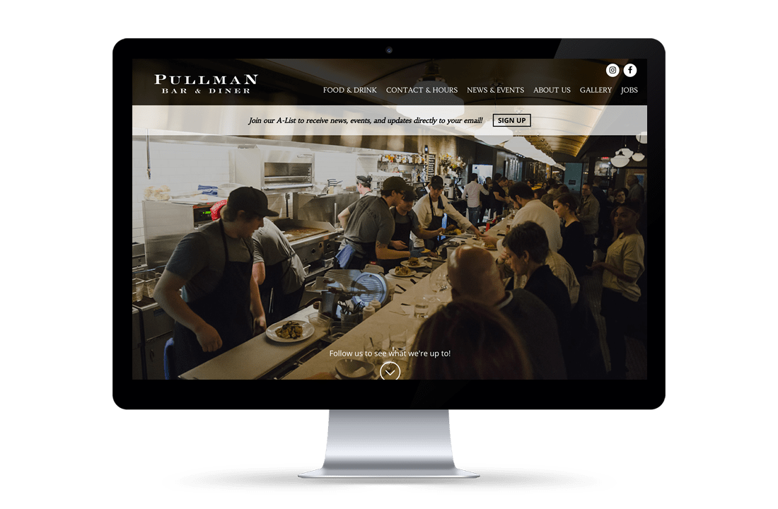
Pullman Bar & Diner is a popular restaurant in downtown Iowa City. Their website needed a visual refresh as well as some TLC behind the scenes to stay secure. Creative Mellen, an Iowa City design firm that we often partner with, presented us with the website design, and tasked us with making the site easily navigable, mobile-friendly, and secure, while implementing their simple, beautiful layout which helps convey the classy-casual vibe of the restaurant itself.
What We Did
- Website Development
Outcome
Pullman now has a site that clearly displays the basic information that customers want to know such as their hours, menus, and specials. In addition, there are fun features that offer site visitors a more intimate experience with the restaurant like the food gallery, the social media feed from their Facebook and Instagram, and the About Us page where you can see the names of Pullman’s managers and chefs.
Project Brief
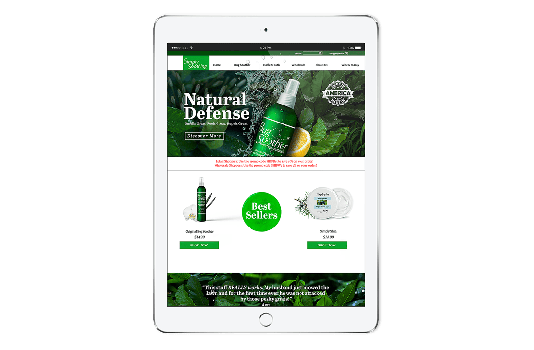
Simply Soothing needed a modern, mobile friendly, e-commerce website to showcase and sell their incredibly popular Bug Soother® product. The website needed to handle both retail and wholesale orders and to include a store locator. As the company continued to grow and orders for Bug Soother® expanded nationwide and then worldwide, Simply Soothing realized the need for a more robust website e-commerce solution. They were also in need of a place for customers to see all of the products offered by Simply Soothing and learn more about the company and its brand.
What We Did
- Website Design
- Website Development
- Website Hosting and Support
- E-Commerce
- SEO (Search Engine Optimization)
- Marketing Consulting
- Brand Identity
- Trade Show Design
- Print Design, Online Marketing
Outcome
Since the launch of Simply Soothing’s new website, online sales have skyrocketed. The website handles sales from both retail and wholesale customers, has a store locator for quick store searches, many features for wholesale customers including a branding page for easy download, and a recently added blog and news section. With the addition of wholesale ordering on the website, Simply Soothing was able to streamline its process from phone and email orders to mostly online ordering. This new process helped eliminate the burden of backlogged phone and email messages from wholesale accounts.
Project Brief
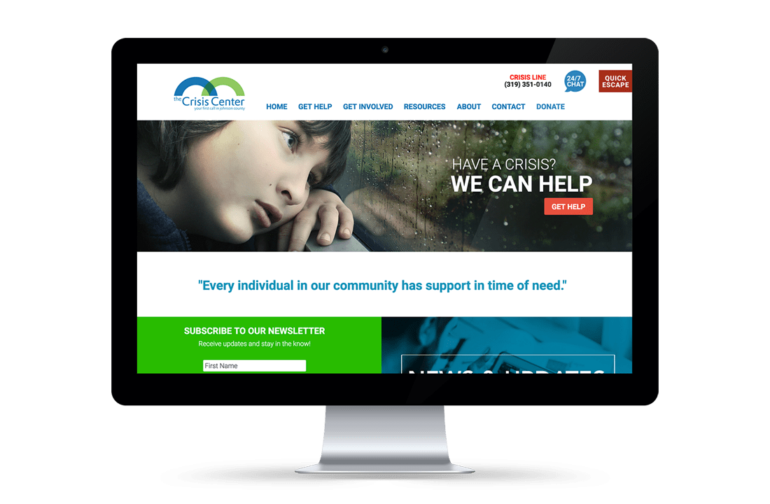
Our goal for the Crisis Center was to modernize their current website reflecting their extensive database of information and services, increase user-ability and functionality, and update their look and feel. In addition, a robust mobile site was also important. Important features on the Crisis Center’s new website include quick access to many of their crisis services, a quick escape button for internet searches being closely monitored, the ability to make online donations, news and updates from the Center, a pledge form for donors and multitude of resources for those in need.
What We Did
- Website Design
- Website Development
- Website Hosting & Support
Outcome
The new Crisis Center of Johnson County’s website features an easy navigation and ordered layout which allows visitors to quickly find help in times of crisis. Links to the Crisis Hotline, emergency assistance, and food bank information drive the website, catering to the needs of those seeking help. The website provides a plethora of resources and information on the many areas of service provided by the Crisis Center. Donors can also use the website for online giving, pledging donations or to find out more about the many ways to get involved. A mass of information, this website is a great tool for the Crisis Center to get information out quickly and provide crisis services at the click of a button!
Project Brief
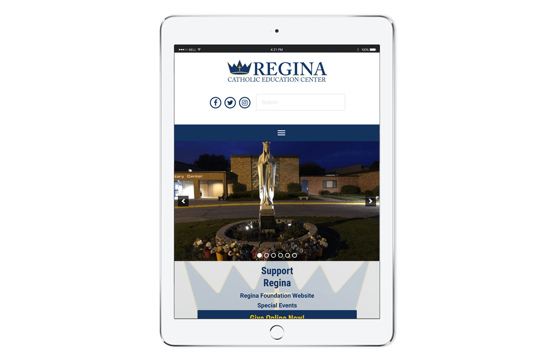
Both the Regina Catholic Education Center and the Regina Foundation needed new websites with improved information architecture, as well as more streamlined e-commerce components. Both sites require multiple forms and payment-processing features in order to process donations, purchases of athletic passes, and orders from the Regina Spirit Store.
What We Did
- Website Development
- Web Migration
- Website Hosting
- E-Commerce
- Maintenance & Support
Outcome
Regina now has websites that are substantially easier to navigate for site visitors, and also are streamlined on the back end. Site administrators now enjoy the ease of forms and orders being placed online.
Project Brief
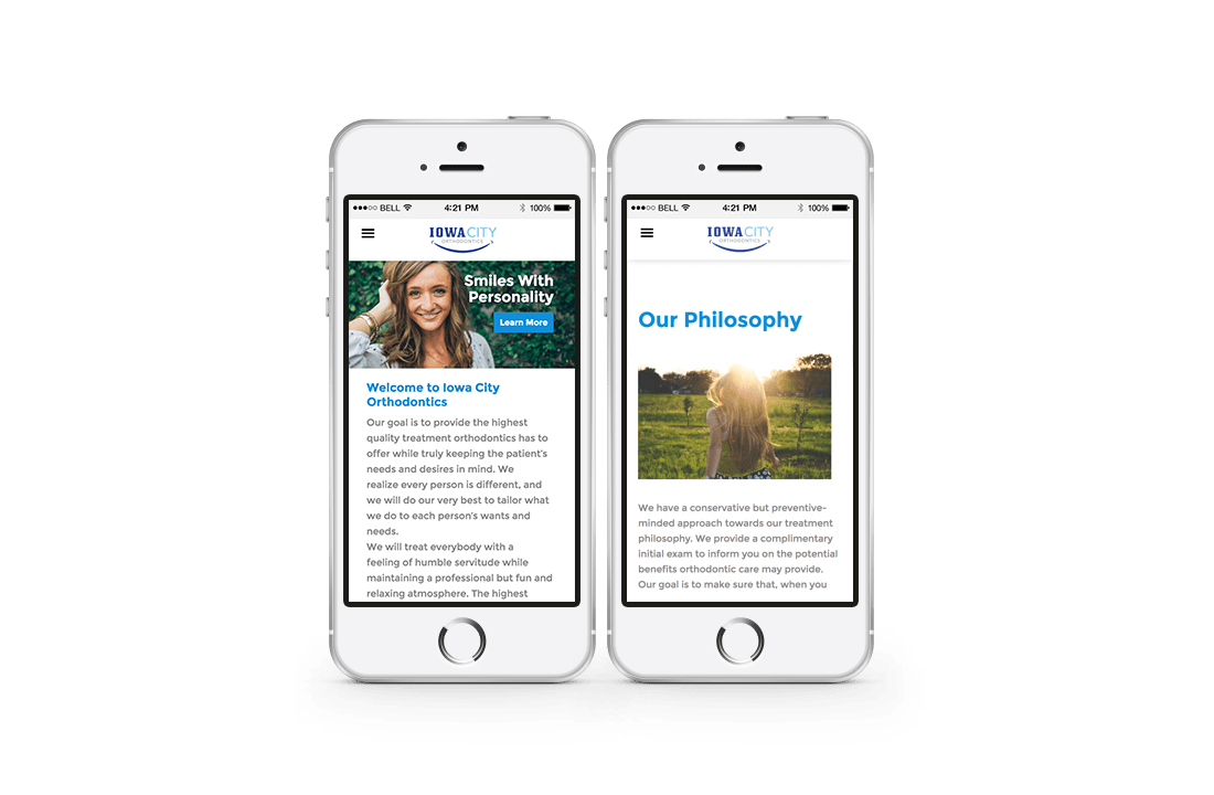
Iowa City Orthodontics came to us needing an entirely new website. They needed a fully revamped design and layout that would provide their patients and prospective patients with the vital information that they might need to know.
What We Did
- Website Design
- Website Development
- Website Hosting & Support
Outcome
They now have a site with a layout that is simple and clean, almost like walking in the door of an orthodontic office. The navigation is simple and clearly directs site visitors to the information that they want to find. Whether it be doctor bios, general orthodontic information, or finding out how to schedule an appointment, Iowa City Ortho patients have a place to go to find what they need regardless of the device they’re using.
Project Brief
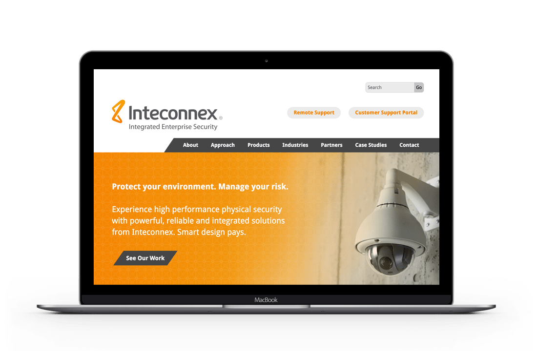
A Cedar Rapids company, Inteconnex provides enterprise security solutions. Inteconnex approached us for the development of their new website, having a design already in hand. We partnered with them and worked together to define the parameters of their development needs.
What We Did
- Website Development
- Website Hosting & Support
Outcome
Inteconnex’s new, clean website was created and content was organized to make it easy to navigate. We were able to accommodate the specifications of the designer while keeping the functionality seamless to the user. The new website is mobile friendly, modern in design and packed with a plethora of useful information and case studies for the user interested in their services.
