Over the years, we’ve done a lot of websites for non-profits. It has basically become an unintentional niche for us. We had fun analyzing the election websites in the previous blog, so we decided to do a similar exercise with a subject we have even more experience with. We decided to choose the websites of just three Cedar Rapids non-profits at random for the sake of keeping it short, though there are of course many other amazing Cedar Rapids non-profits that aren’t listed here.
Greater Cedar Rapids Community Foundation

What the site does well:
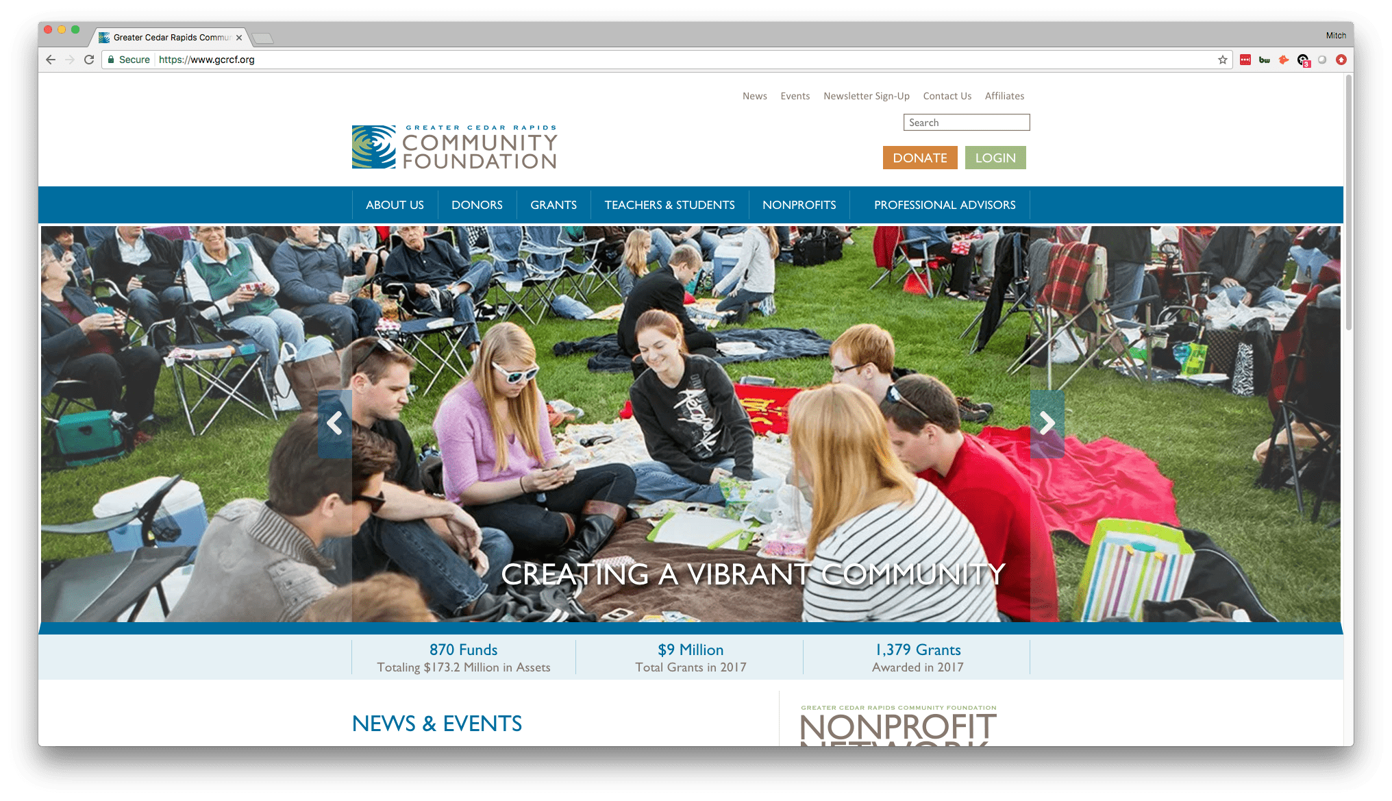
- The calls-to-action here are great. The “Donate” and “Login” buttons are prominent and are differentiated from the surroundings by their colors, leading people’s eyes directly to them. This is great placement and usage of these calls-to-action, and my guess is that this donate button has generated a good amount of revenue for them simply because they make it easy for site visitors to give money! Cedar Rapids non-profits, and non-profits everywhere, need to make it as easy as possible for folks to give money online.
- Right below the header image, they list three major metrics that show how successful and effective they are, which immediately injects confidence into the site visitor who is planning on donating. These particular figures they have displayed tell the donor “Hey, we do this a lot. Give us your money and it will be put to good use.”
- There’s a lot of content on this website, but the navigation is done very well, making it easy to navigate right to the information you want with just a few clicks. The drop-downs on the main menu are clean and function well (there’s nothing worse than a drop-down that disappears on you).
Where it can improve:
- This is a great website, so it’s hard to find things to improve on it. One thing that stands out, however, is that the images in the header on the front page aren’t the highest quality. They’re a bit grainy, and with a website this professional, it’s expected that the images are crisp and professionally done.
- There are two navigation bars on the homepage, one along the very top that has “news, events, etc.” and then the main navigation with “about us, donors, etc.” There really should only be one, for simplicity’s sake and for the sake of the aesthetic. Perhaps there’s a good reason why they have these two navigation menus, but ultimately one is preferred.
Families Helping Families of Iowa

What the site does well:
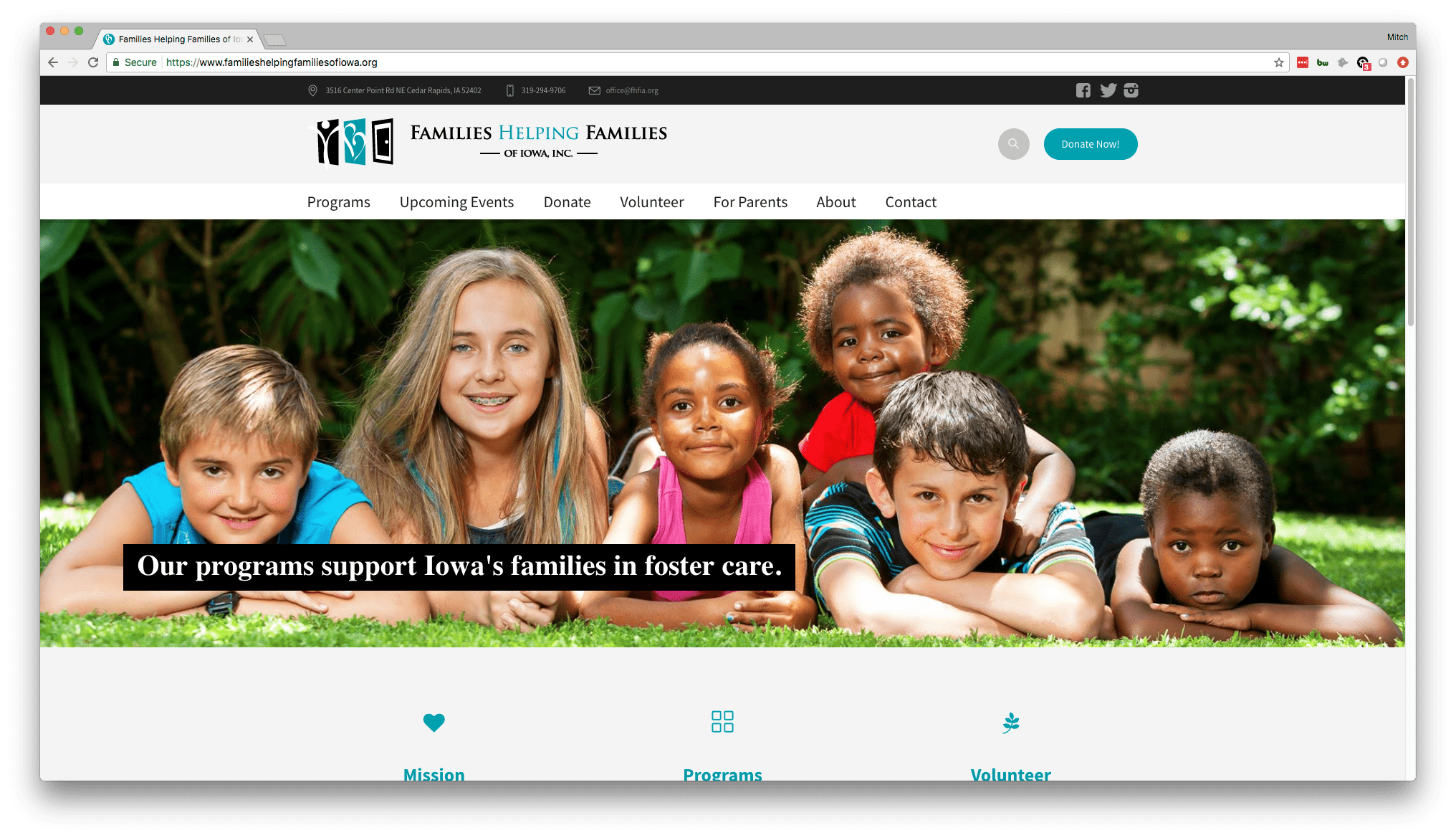
- Two big things stand out as positives right off the bat – first, the images used are high quality and look great all all screen sizes. Second, the call-to-action to “Donate Now” is nice and prominent right there at the top. They’ve clearly thought through what their primary goal is for their site visitors, and they created their site to be as conducive as possible to achieving that goal.
- “Families Helping Families” is a bit of a vague name, so it’s crucial for them to clearly state what exactly they do in a clear and concise way. They communicate this very well on the homepage with the short sentences in the header slideshow, as well as in the three icons below the header that state their mission, specific programs, and their volunteer opportunities. You feel “bought in” very quickly after coming to the site because they do a great job of showing what they do and how you can be a part of it.
- Rounding out the homepage, they continue to make great use of space with both a touching video and some quick statistics further showing why the work they do is so important and impactful. We’ve discussed before how videos can be an effective marketing tool, and having some hard hitting statistics always gets your value across in a clear and digestible way. They do a great job of showing other Cedar Rapids non-profits how to win over your site visitors by pulling on heart strings.
Where it can improve:
- They say nobody’s perfect… But this site is pretty close. Aside from nit-picky tweaks, there really isn’t anything to change about this site.
Gems of Hope

What the site does well:
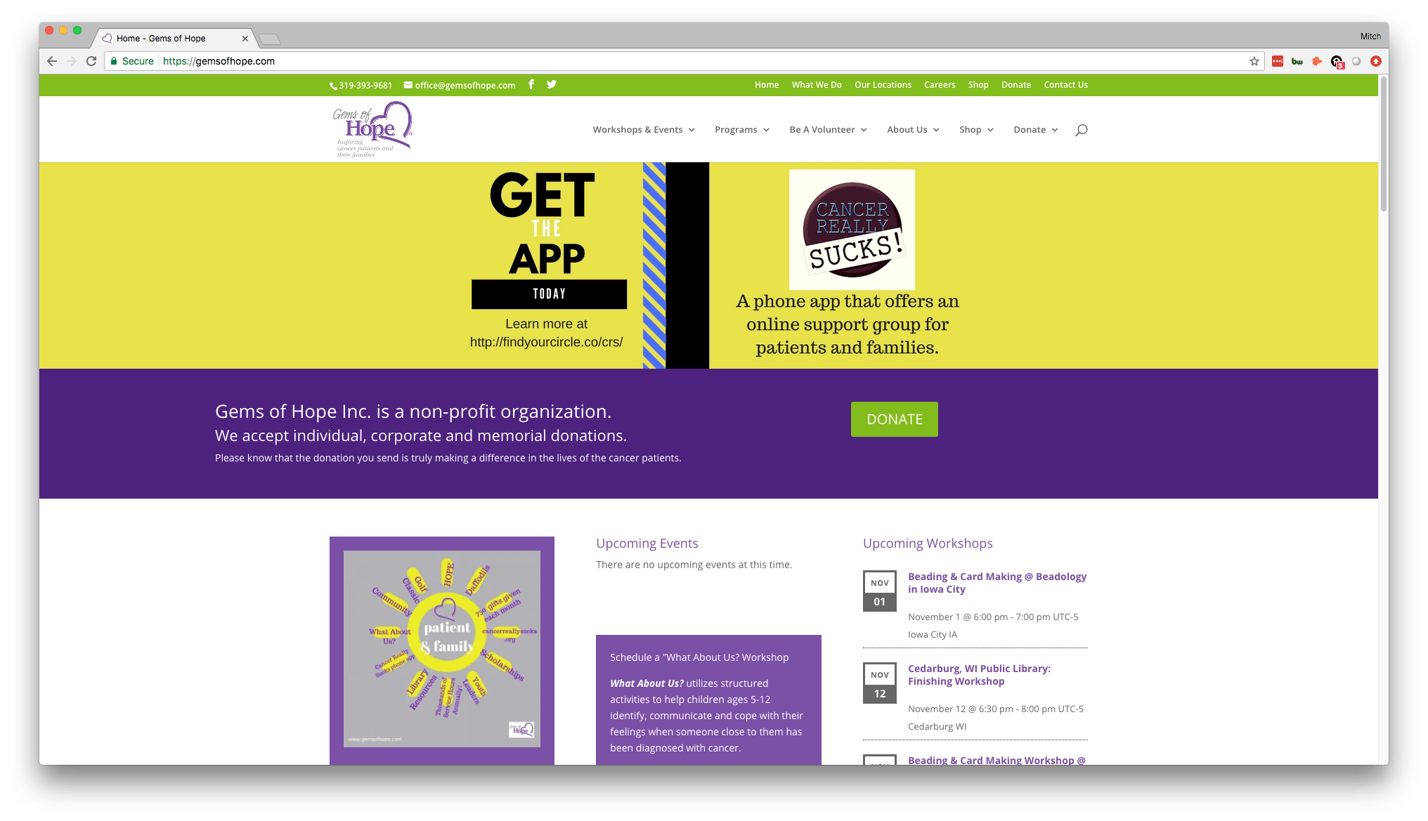
- You can tell immediately upon arriving on the site what actions they want you to take, and that’s what makes an effective call-to-action. The actions of course are to donate and download their app.
- As you scroll down the home page, you see some key statistics, more calls-to-action (like to shop for their products or to become a volunteer), and even an informational video about volunteering – which are all positive points we made about the last website, so it’s great that they’re putting these things to good use on their site.
- Their workshops seem to be a major part of what they do, so it’s great that they have the schedule of all their upcoming workshops right there on the front page where they are easy to find.
Where it can improve:
- The design on the home page is a bit crowded, with a little too much text and images. It would be most effective to have it be simplified and cleaned up so as to not distract site visitors from the calls-to-action that they ideally want them to click on.
- While their “Upcoming Workshops” schedule is updated and full of events, their “Upcoming Events” schedule is not. This could be because it simply hasn’t been updated (which is a problem), or it could be that they just don’t have very many events, in which case an events schedule front and center on the home page is unnecessary and they should utilize a different method of displaying their sparse events.
If you are a non-profit and need web design help, Big Imprint is a web design agency that serves the Cedar Rapids and Iowa City area. We’ve worked with over 40 Iowa City and Cedar Rapids non-profits, and we’d love to talk to you about your project!


