It’s midterm election season again, and that means that a bunch of candidate websites have popped up all over the place. In the Cedar Rapids election world alone, there are a ton of candidates running for various offices both on the state and local levels. Without any regard for political party or candidate preferences, we’ve decided to analyze the Cedar Rapids election websites to see what each does well, and where each could improve.
Let’s start at the higher offices and work our way down to the local Cedar Rapids election sites.
Rick Stewart – Running for Secretary of Agriculture
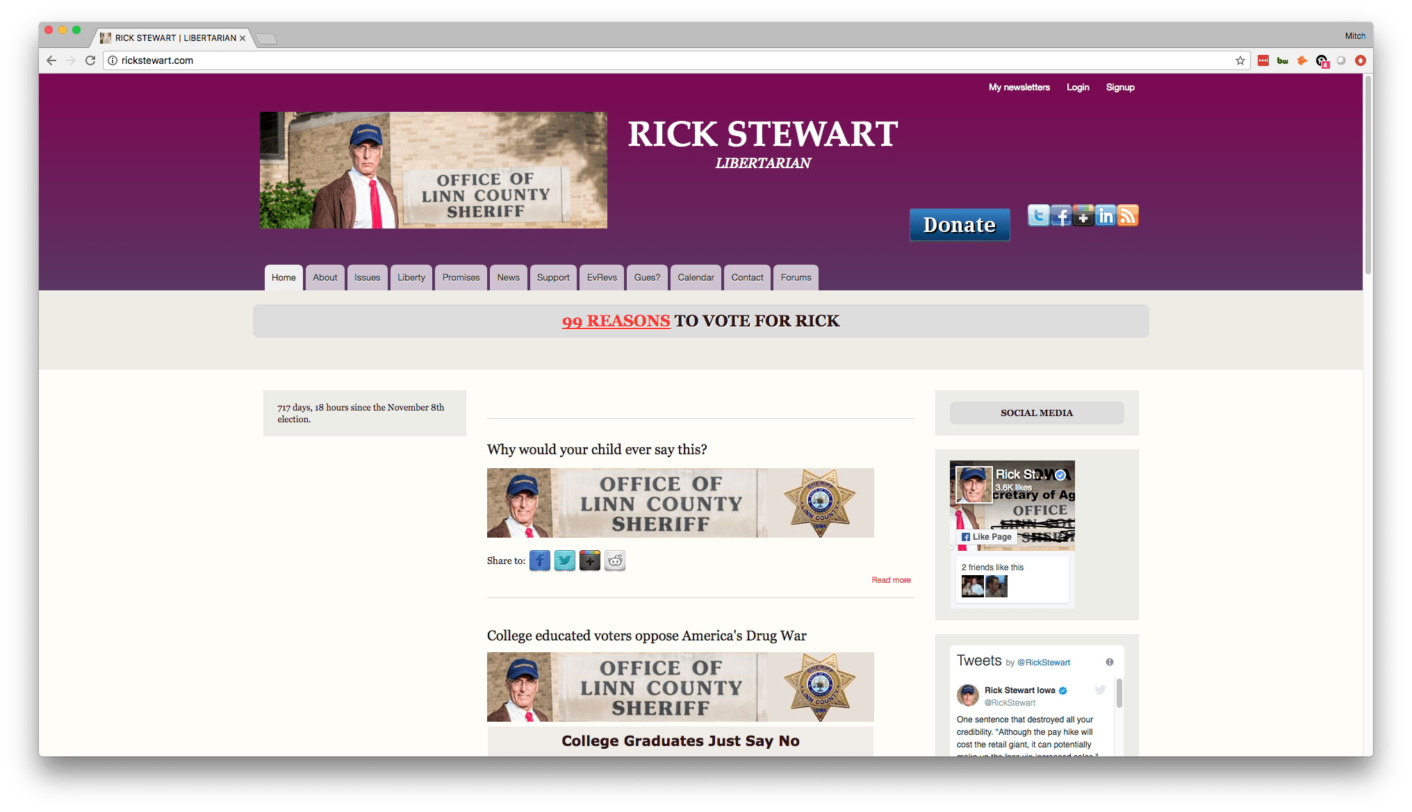
What the site does well:
- The site contains a lot of information that clearly encompass his views on a variety of topics.
- He has a great call-to-action in the “99 Reasons to Vote for Rick” button, which takes you to a literal list of 99 reasons he thinks you should vote for him – clever and useful!
- He has an active social media presence, and it is embedded right there on his site.
Where it can improve:
- The overall design is pretty dated, so the site could afford to get an updated, modern look.
- While there is a lot of information, it’s a little over the top with no clear path for site visitors to take. The “99 Reasons” call-to-action is good, but other than that, you really have to rifle through a lot of content to find what you’re looking for. Rick could afford to cut down on the information and just hone in on a few main points.
Bernie Hayes – Running for State Senate
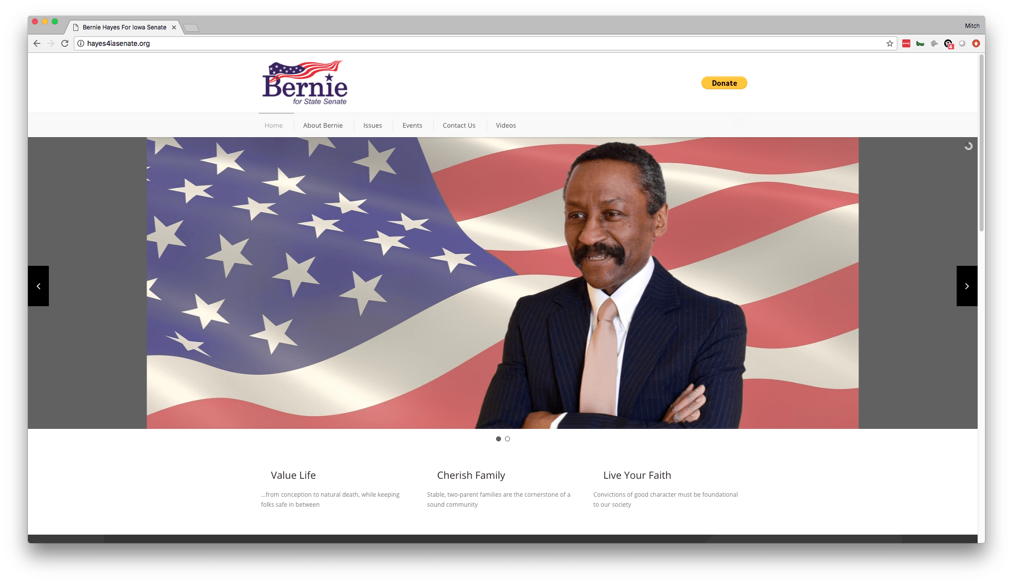
What the site does well:
- The three main points are really nice below the header image. It shows Bernie’s main values and gives a good synopsis of what he’s all about.
- The site is clean and doesn’t overwhelm you with information.
- Clear call-to-action to donate is good.
Where it can improve:
- While the call-to-action to donate is good, it may be nice to have another call-to-action in case some people aren’t ready to contribute financially, such as a newsletter they can sign up for. It’s always good to have a way for folks to show they’re interested without necessarily just asking for their money.
- Again the site design is a bit dated. A little more color and pizzazz wouldn’t hurt to show more personality.
Rob Hogg – State Senate Incumbent

What the site does well:
- Again, the clean look doesn’t overwhelm people. The page is easily-scannable, and people can navigate to the relevant page they’re looking for.
- The calls-to-action are great, giving people the option to give money, or to contact them with questions.
- The pictures are good, as they show a commitment to family, and position him as a doting father and husband.
Where it can improve:
- It’s always good to have another call-to-action besides just “contact us” and “donate.” Both of these actions require a little too much commitment, especially for folks who are just dipping their toes in the water. Make an easy, low friction option available to them, like “sign up for the newsletter” or “get my list of stances” where they can enter their email and get information, rather than giving money or entering into a conversation.
- Again the design of the website could use a little updating. Sites that don’t fit the full screen on a desktop show that they aren’t fully responsive, which is a given in modern web design.
Liz Bennett – State Representative District 65 Incumbent
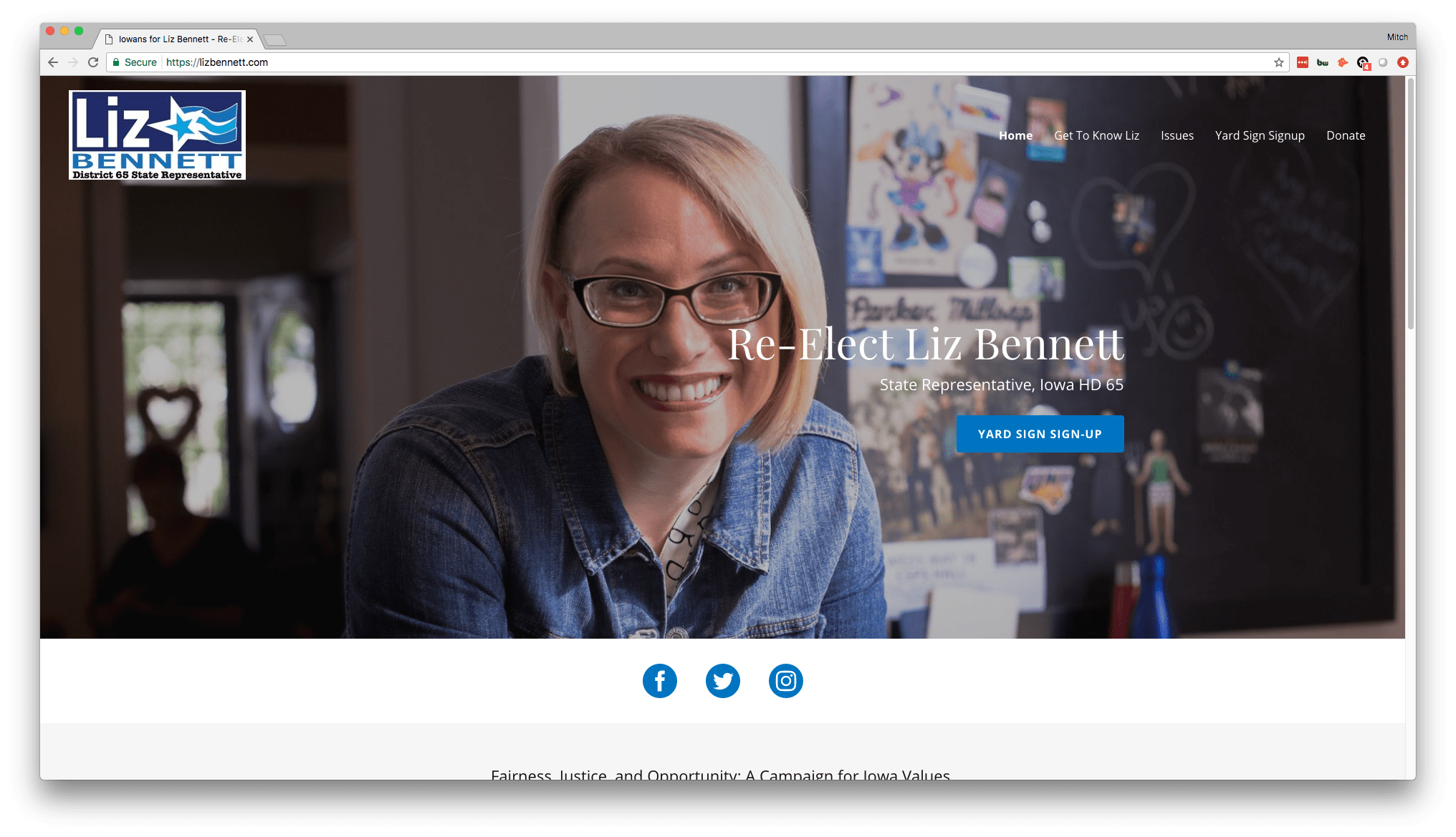
What the site does well:
- The call-to-action here is great. She’s getting the word out by having folks host yard signs, which then gets more and more peoples’ attention and brings them to her website as well. That’s great usage of a call-to-action.
- The site is responsive and takes up the whole screen, and the navigation is clean and easy to understand.
- The social links are well-placed and are a great addition to get people to her social sites to like and share. Again, more great ways to spread the word.
Where it can improve:
- The site is a templated, simple site, and we of course like to see custom-designed websites. Regardless, Liz made the most of this and it still looks nice, modern enough, and most importantly for her, it was probably affordable.
- A little more color wouldn’t hurt to better engage Cedar Rapids election voters, but it’s a clean look that works well.
George Olmstead – Running for State Representative District 65
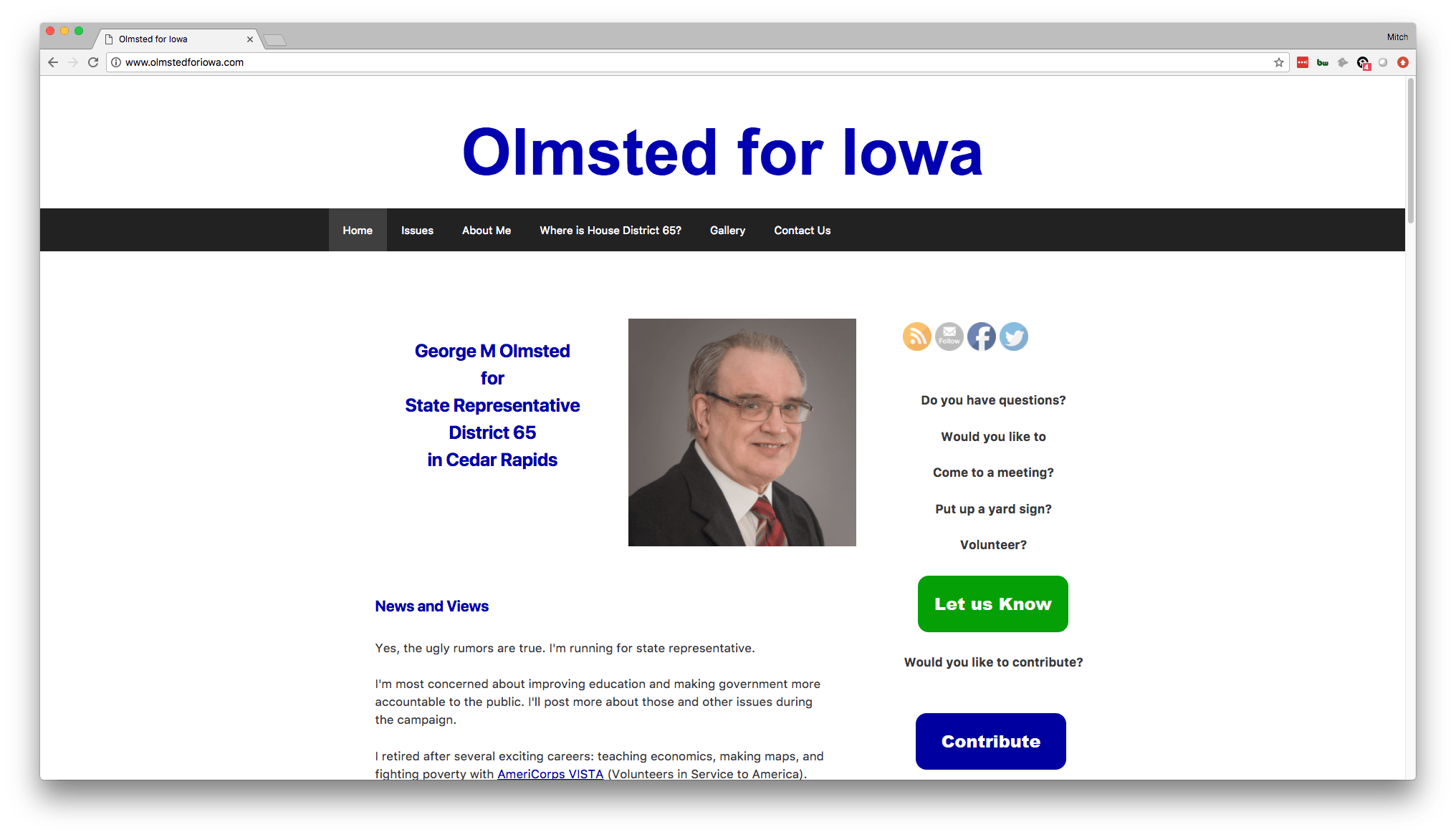
What the site does well:
- Great placement of calls-to-action.
- Nice little introductory paragraph that lets you get a feel for who George is (and his sense of humor).
- Clear navigation allows you to quickly get to the pages with the information you want to see, such as where he stands on issues and information about him and his life.
Where it can improve:
- Again, this was probably put together on a tight budget, with little to no time allocated toward design. With that said, this is an incredibly simple and seemingly outdated site, design-wise.
- More pictures of George would help. The one image of him on the homepage is small and a little stale. He seems to have a good personality, judging by the text on his site, so it would be great to show that personality in action with images of him shaking hands and interacting with his constituents.
Teresa Daubitz – Running for State Representative District 66
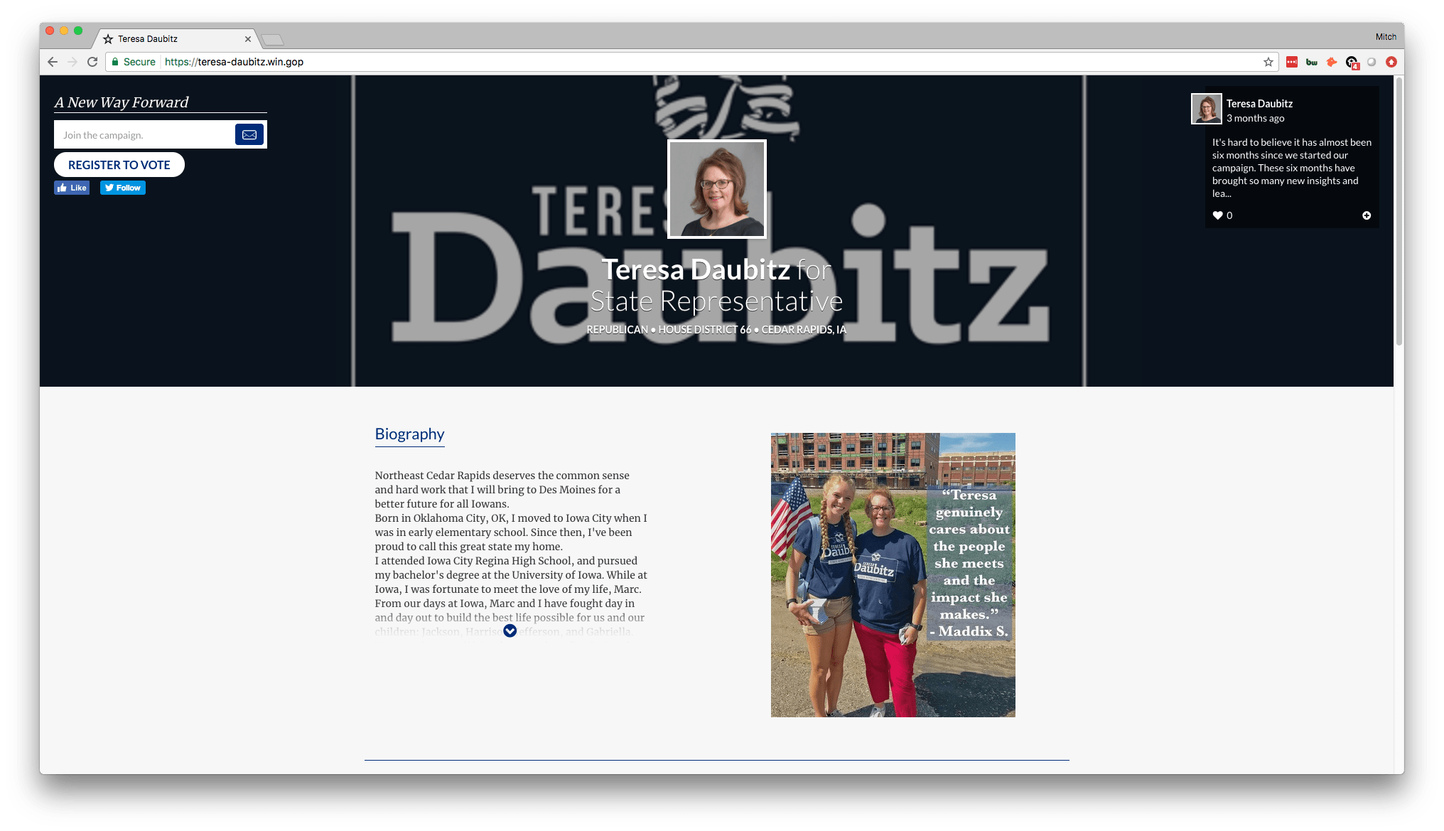
What the site does well:
- Nicely lays out who Teresa is front and center, with her biography being the main thing that you see on the page.
- The call-to-action to register to vote is nice and helpful for folks who may not be registered. There’s also the option to sign up for her newsletter, which is a strong call-to-action for a candidate’s website.
- The usage of pictures of her interacting with constituents as well as other politicians is very strong. Shows her personality, experience, and that she cares.
Where it can improve:
- This appears to be a GOP-provided web system that is meant for GOP candidates to use on their campaign. That said, it must not be tended to properly by Teresa’s camp because the formatting is entirely out of whack. It’s a weird layout to begin with, then on top of that, things are shifted off-center and it looks a bit messy.
- The navigation is not along the top like most websites, which confuses site visitors when they first come to the site. When it comes to web design, it’s best to just follow the crowd and have a relatively standard format, because when you deviate from that it will commonly confuse and frustrate site visitors.
Art Staed – State Representative District 66 Incumbent
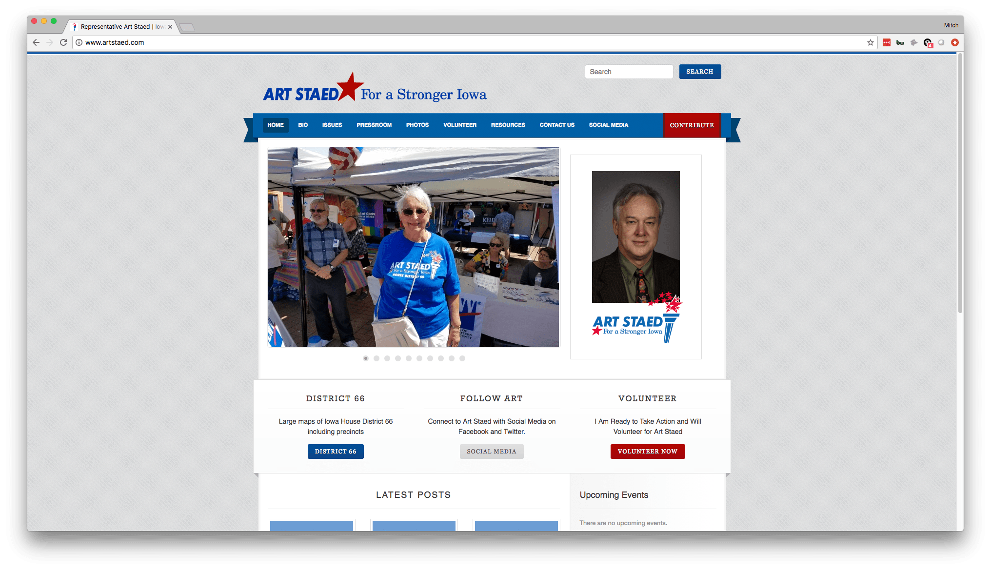
What the site does well:
- Clear formatting and navigation – which is always key.
- Calls-to-action across the home page are great. Clearly he emphasizes volunteering, so it’s good to have that call-to-action there in red to draw people’s attention to it.
- Lots of pictures, which are really great to show Art and his personality and involvement in the Cedar Rapids area.
Where it can improve:
- Not a modern design. It’s not responsive and doesn’t take up the whole screen, which is a dated look.
- Other than this, the site serves it’s overall purpose very well.
Eric Gjerde – running for State Representative District 67
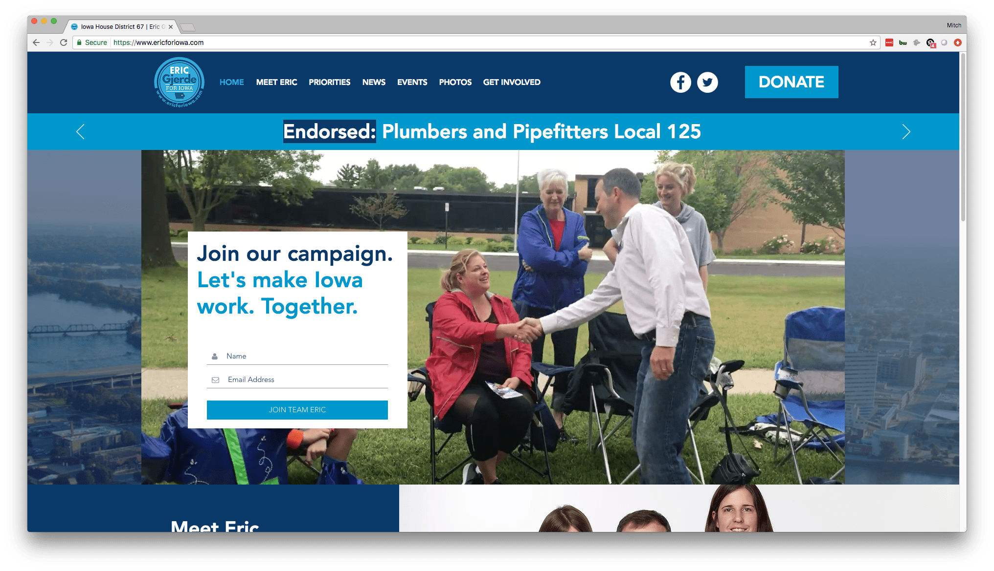
What the site does well:
- This is probably the best Cedar Rapids election site of the bunch. The header image you see there of Eric shaking hands is actually a video that automatically plays, which looks great.
- The colors and pictures are engaging.
- The call-to-action is front and center and really nicely designed.
- Quick facts about Eric scroll across the top where you currently see “Endorsed: Plumbers…” which is really cool and tells a lot about Eric’s history and where he stands on issues at a glance.
Where it can improve:
- Aside from nit-picking, there is really nothing to complain about here. This is a really great Cedar Rapids election website.
Ashley Hinson – State Representative District 67 Incumbent

What the site does well:
- Again, like Eric’s before this, this is a really nicely designed website with great color and imagery.
- The site is responsive and fits to the whole screen.
- Pictures are great and show Ashley interacting with politicians at the state house, showing her experience and credibility.
Where it can improve:
- The main thing that seems to be missing is a call-to-action front and center. The “About Ashley” call-to-action should be joined by or replaced by a stronger request, like “sign up or newsletter” or the yard sign idea we’ve seen before.
- Other than that, this is a really nicely done Cedar Rapids election website!
Molly Donahue – Running for State Representative District 68
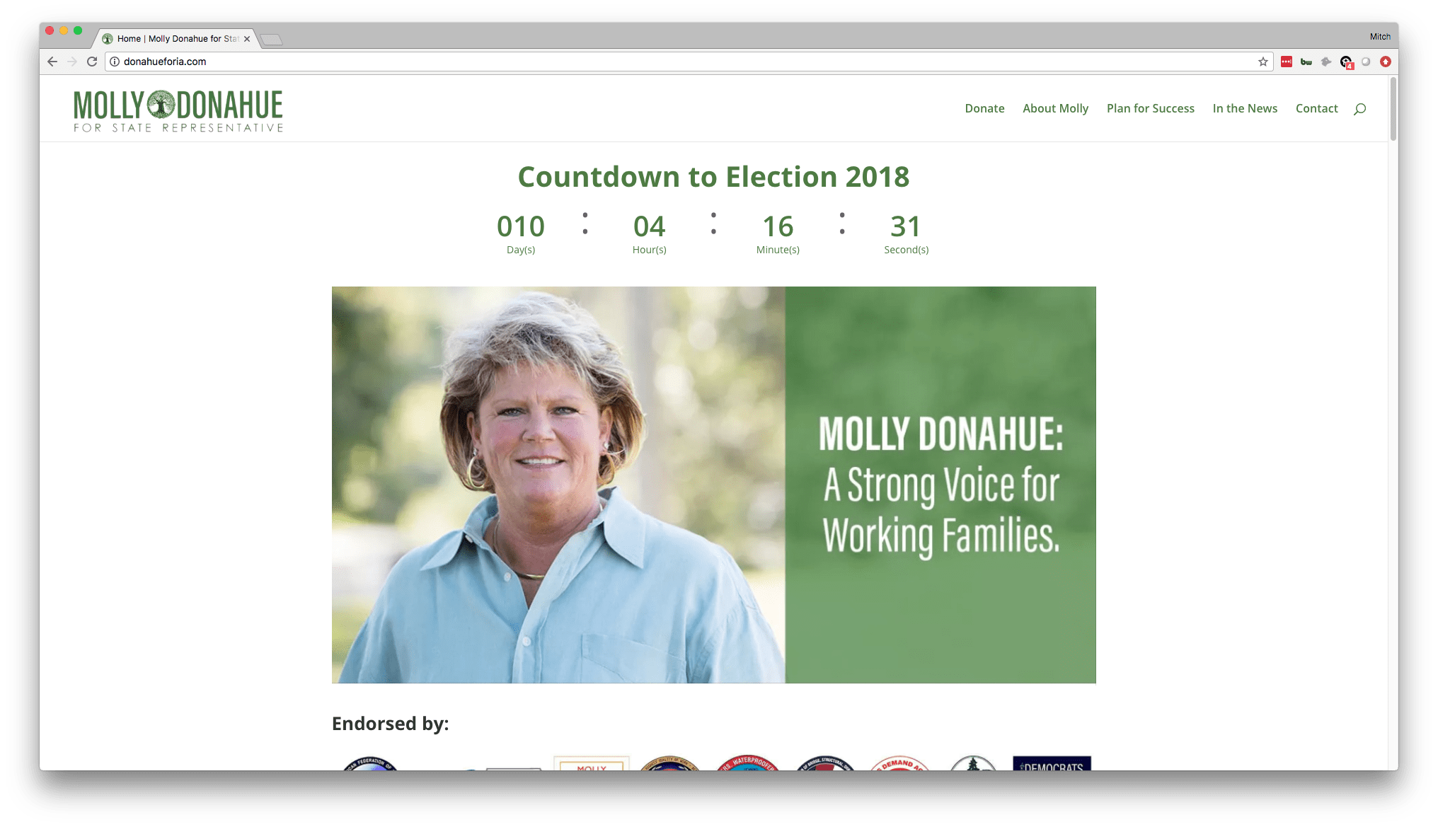
What the site does well:
- The site is clean and easy to navigate (stop me if you’ve heard this before).
- The color scheme of green is a unique choice and a variation from the more common red, white, and blue color scheme that most use political websites use. Whether or not that’s a positive is unclear – sometimes the subconscious correlation people make about color in their minds can be used to your advantage. When folks see Molly, she wants them to picture her in office and as a political front-runner for this Cedar Rapids election. Green doesn’t enforce that political office mindset quite as much as the classic red, white, and blue.
Where it can improve:
- Aside from the question of whether green was a good choice, the only other critique is that the images are all relatively low quality. They look grainy on a desktop, which isn’t ideal. The site is designed nicely overall, but low image quality is a knock on the design.
Randy Ray – Running for State Representative District 68
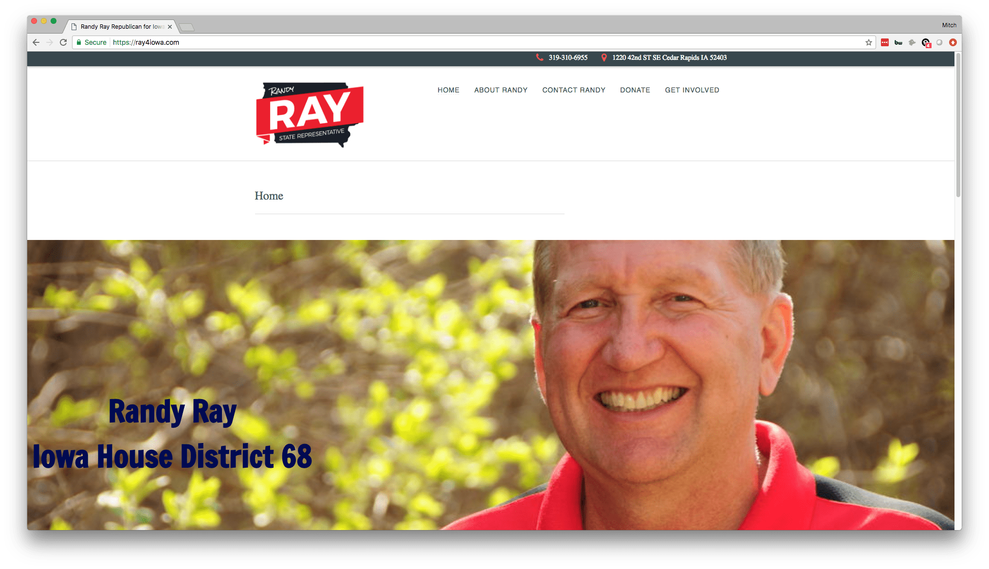
What the site does well:
- This is a nicely done logo Randy has. The prominence of it is good, as it certainly goes along with much of his other marketing material, like pins and yard signs that he has probably utilized for this Cedar Rapids election.
Where it can improve:
- The navigation is all messed up. For some reason there are two Home buttons, which is some sort of glitch that can be easily addressed on the back end.
- As you scroll down the home page, you see that things are off center. It looks like the formatting of the page is off, which is another easy fix. Looks like someone just needs to go in the back end and tighten up a few screws and this site would look pretty good overall!
Big Imprint is a web design agency that serves the Cedar Rapids and Iowa City area.


