As we’ve discussed a few times before, we realize that non-profits tend to have limited budgets. So you may see the websites listed below and think, “Yeah, of course they have amazing websites – they’re loaded!” But while it is true that these non-profits are among the highest in the world in donations received, the fact is, money is not always the best indicator of whether a website will be good or not.
There are plenty of examples of really wealthy non-profits having poor websites, and there are plenty of examples of small non-profits having good ones. There are plenty of web design companies out there that are capable of giving you a really well-designed site that doesn’t break the bank.
So as you look through these few examples, just use them as inspiration. If you like the look, maybe use it as a guideline for your web designer to follow. Chances are good that as long as you’re using a professional web designer, they’ll be able to create a site with your desired look and feel, even if they don’t cost $50k like the big non-profits can spend.
1. World Vision

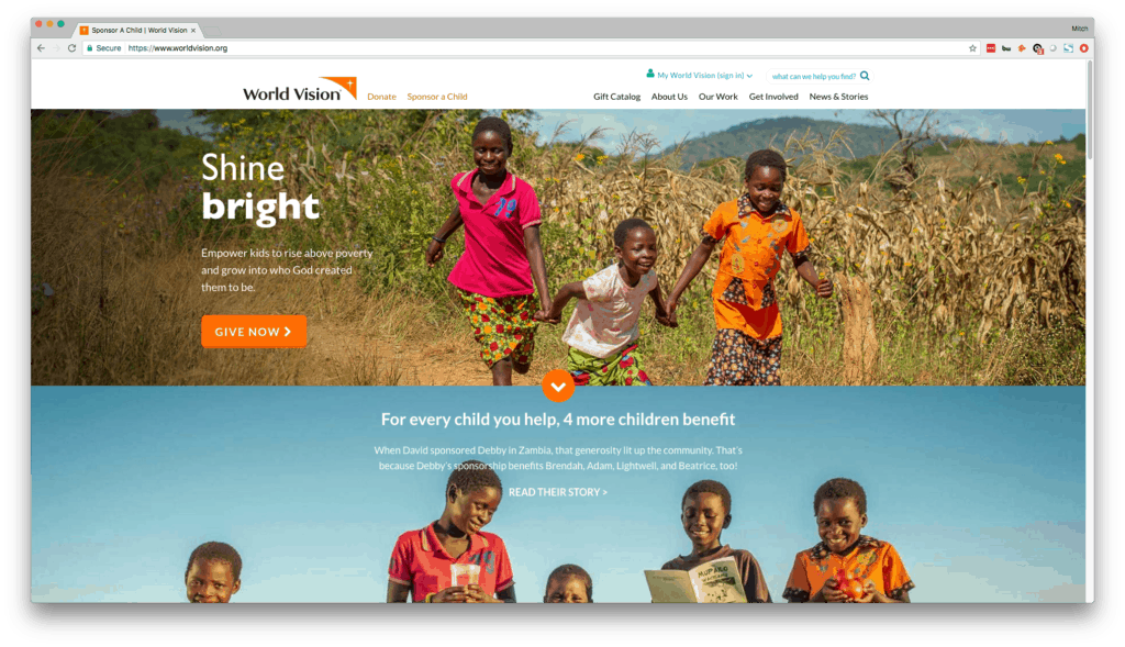
What stands out the most about the World Vision website is first and foremost the images. These images are high-quality and colorful and really grab your attention. What makes these images even more powerful is the fact that they display actual people who are affected by the efforts of World Vision.
In addition to the images, as you scroll down the screen, you’ll see really well-designed icons that convey their primary organizational goals, as well as high-quality logos for major outlets that have promoted their organization.
If you take the basic concepts of high resolution images, custom icons, and relevant logos to your web designer and have them whip up a web design for you featuring these things, chances are good that the site will look very modern and professional, regardless of whether you paid the designer $1200 or $50,000.
2. Direct Relief

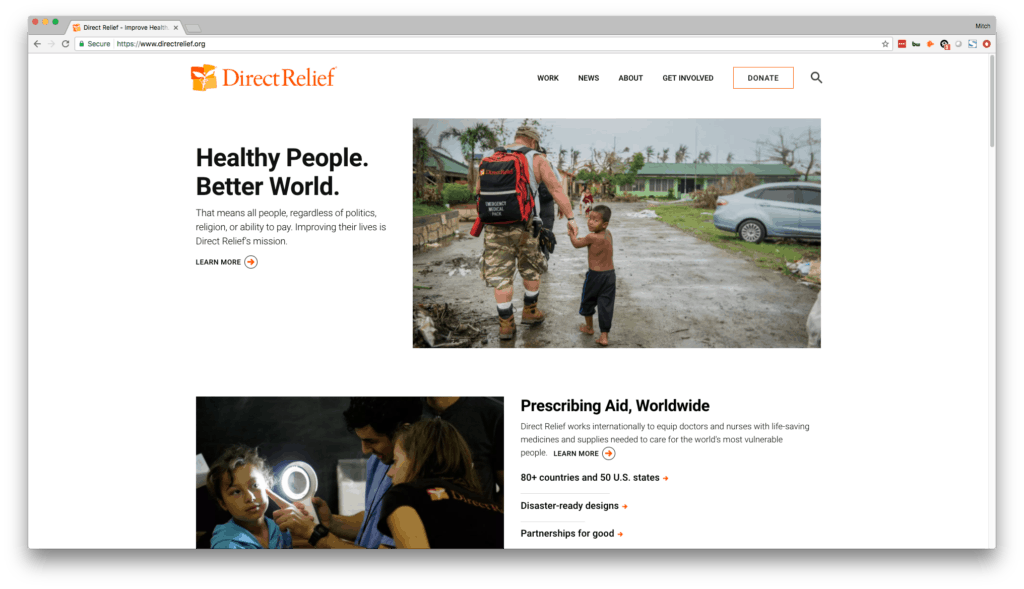
The real beauty here on the Direct Relief website is in the simplicity. While the images are high-quality and impactful in showing how they help people, they aren’t necessarily the focal point of the whole page. The offset images next to descriptive text and calls-to-action show they want to direct people’s attention to other areas of the site where they can learn more.
Simplicity, when not done well, can look like shoddy or lazy design. If you’re going to go with a minimalistic feel, you will want to make sure you work with a designer you trust who can carry out the minimalist look without it looking incomplete or bare.
Web design truly is an art, and that is never more evident than in simple, minimalistic design. Having a site like Direct Relief is certainly do-able, but if you’re trying to pinch pennies, you run the risk of ending up with a site that looks unintentionally bare instead of artfully minimalist.
3. Americares

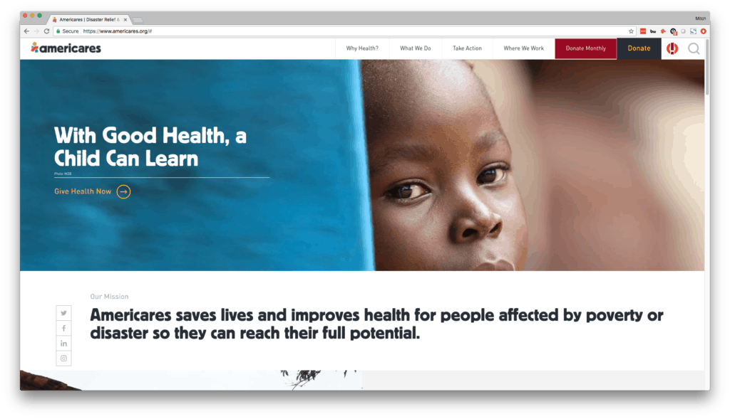
The beauty is in the colors on this site. The image above doesn’t show much, but as you scroll down the homepage on this site and interact with the navigation menu across the top, you’ll see that color plays a prominent role in the design.
The dynamic movements and dropdowns of the menu look great and also make it easy for site visitors to find what they’re looking for. The video halfway down the page is a great touch and displays what the organization does and who it impacts. Scroll further down the page, and you’ll see beautiful custom-designed colorful icons, a blog section, a news section, and an email newsletter sign up – all using colors and images that attract your attention and flow beautifully together.
Being completely honest, if you’re going to use this website as your guideline for your own non-profit’s website, it would require a pretty hefty investment in design and development. As far as colors go, you can certainly have a designer incorporate more colorful elements in to your website even on a limited budget. Adding splashes of color gives a sense of modernism, even to a simple, templated site. For instance, we worked color into a recent website that we built for a non-profit and it turned out really beautiful.
I hope you find these sites helpful as you look for web design inspiration for your non-profit website. We’d be happy to discuss putting any of your ideas/inspirations into practice, so feel free to reach out to us to discuss your non-profit web design project!


